


How often do we Linux advocates and enthusiasts hear the complaint that Linux lacks the polish and refinement that users expect from their desktop? For most end users, it doesn’t matter how good the underlying software is. If the interface sucks, then the software itself sucks. While it may pain some avid Linux adherents to say it, this is part of the reason why desktop Linux has yet to catch on with a broader set of users: Linux has struggled for years to come out of the woods and be perceived as visually appealing and pleasant to use.
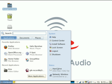
Those who read this blog probably know that Interaction Design matters a lot to me. It has been one of the things I have advocated extensively in my work with desktop Linux. To be sure, part of why I still like working for Novell* is that the desktop team at Novell continues to produce not only great technical advancements, but also continuous improvements in the look and feel of the desktop. The new Main Menu for Gnome that debuted with SLED10 showed how studying user interaction with the desktop can result in a strikingly improved interface. (I don’t kid myself here–there are many who have vocalized their preference for GNOME’s traditional Applications-Places-System menu. But, many do like it.)
I’m pleased to share that the desktop design team at Novell is working on further improvements to the original Main Menu. The video below comes from the upcoming SLED10 Service Pack 1 as it looks in the current internal beta 3. (The unreleased status means that this is not necessarily the final product, and things may change from what you see today.
Video information:
- The video is a 12.1 MB Ogg Theora file.
- I recommend using something like Totem for viewing. (Helix/RealPlayer did not play the video very smoothly.)
- I narrated the video using a small PC headset rather than a professional microphone, and I did no post-production editing. So, it’s kind of rough.
- If the video link is broken, please leave a comment. then I will put it on a different host.
- If you cannot get the video to play, there is a low-resolution version on Google Videos.
*Yes, I say “still” that is an admission that I have been challenged with a certain, recently-cemented partnership
Related Posts:
- …they’re brewing up some polish…
- Show Me That New GNOME Main Menu
- Customizing the GNOME Main Menu
- Products and Projects: What’s in a Name?
Filed under: Advocacy, Free Software, Novell, openSUSE |


Great – It looks like another positive step forward in usability. One minor suggestion: the Applications, Documents, Places buttons still feel disconnected from the content. Perhaps a tab-type control would be more appropriate?
Thanks for the sneak peek!
I agree with James.
A tab control would have been great.
[…] Check it out here. […]
Yeah I agree, it was the first thing I thought when I looked at it, I think tabs would be more appropiate
Good work
btw, if anybody wants to try this, Jimmy is developing it in the open in the version-2-branch in GNOME SVN:
http://svn.gnome.org/viewcvs/gnome-main-menu/branches/version-2/
Great sneak peak. Would it be possible to enlighten us as to the other improvements in SP1? Is there going to be better hardware support – like in openSUSE10.2 etc.
Oh by the way, PLEASE DO NOT LEAVE Novell!!! NOA would not be the same, nor would my linux experience as your knowledge and advocacy only enhance my faith in it and help me promote linux.
I agree with James in the previous post, putting the App, Docs and Places buttons in a tab type control would make it feel connected to the rest of the main menu.
This sure does look good, is there plans to release this for OpenSuse or will it purely be just SLED10 SP1?
Keep up the good work 🙂
The Main Menu should has rounded corners like the Computer button. Current situation looks a bit inconsistent. Otherwise I am pleased to see good work has been done.
I’ve got a HOW-TO for Ubuntu Feisty (may work on Edgy – need someone to test!) up on my site, here. [Original link changed, so updated by Ted.]
Anybody have any idea when the Recently Used Apps patches will ever make it upstream?
Also, I cannot seem to find a gconf setting to change any of my System area items in this release – whereas it existed in prior releases.
And on a more personal note, what GTK theme is that and where can I find it? 😉
[…] DST issues over at the Windows camp, Novell boasts an automated solution. It also presents some neat changes it has applied to its SLED/GNOME menu. Meanwhile, talks about virtualising Novell’s Linux under Windows begin to materialise. […]
[…] SLED SP1 Gets a New Gnome Menu […]
hi
you should add your blog to gnome’s planet 😉
One question…does this Places thing show bookmarks created from nautilus? i.e. the places locations shown on the older menu (the traditional application, places, system)
[…] Novell, Linux/OSS, Cool Blogs, openSUSE — Ted Haeger @ 8:26 am So you don’t like the SLED10’s Main Menu–you prefer the traditional Applications-Places-System menu in Gnome. A few people have […]
Is it really necessary to defy the user’s GTK theme and GTK appearance guidelines by putting fancy backgrounds, headings and corners in? It’s going to come back to bite you in the form of clashes with people’s colour schemes, and inconsistency with the rest of the desktop.
Looks great. I see though, that there appear to be three different button styles. First, there is the “Computer” button itself, on the panel. This looks great, and I think the hover-effect is helpful. Second, there are the “Applications, Documents, Places” buttons at the top of the menu. These appear to use a custom style and do not match the system buttons (though they do look good). Perhaps tabs would be more appropriate here? Finally, the light blue area on the right seems to show default Gtk buttons when you mouse-over the links. It would be nice to try to get more consistent widgets here – even if some need to be newly created.
This is just really very similar to the XP start menu (OK there are categories at the top)
The favourite apps is useful, but you still have to press another button to get to the rest of the apps – what I find nice about the normal gnome menu is not having to press an extra step of an ‘All applications/More Applications’ button…
Still good to see UI research going on, but I just don’t see anything amazingly innovative here… maybe good for migrating users from XP though
Stu [17]:
For me, it’s not very similar to the XP menu. That menu is so cluttered, and I find it to be confusing.
–Ted
What I don’t get is are those statistics. You have this much hdd space left and you are connected into that network.
Network manager spams you enough about the network connectivity issues and usually keeps you connected. I see no extra value of wasting the space in slab for that.
I always assume to have enough HDD space and why wouldn’t I? 500G desktop HDDs are ordinary, on laptops the smallest you can get is around 80G already. Most of the users (not doing a lot of warez etc) will never hit those limits. I know I won’t.
Furthermore on my opensuse 10.2 the slab sometimes takes 30+ seconds to pop up. I have no idea why, but it seems to eat memory and act weird. Most likely the reasons have been fixed in svn already but you really should look better after the potential slow-downs. Users use that menu because they didn’t have the tools for their task available – while waiting their work is typically 100% stalled and even couple seconds feels like a century. (Yeah, my experiences are on a pretty hi-tech brand new laptop and it pisses me off too.)
Erik [19]:
Consider what the interface was designed for: basic office workers being supported in an enterprise. Those statistics are not necessarily interesting to the end user, but the help desk person on the phone can get vital facts without having to tell the user to do much.
–Ted
I’ve been playing with the menu in ubuntu feisty, and it still has some rough edges. Notably, it would be nice to *quickly* get the list of apps (bringing up the dialog can take a few seconds!), maybe integrated into the top (tabs for each of the categories, blend in the list of apps when the category is chosen?) Same with list of places. It also very much annoys me that the places I’ve manually placed (e.g. my dissertation directory) are nowhere to be seen!
Looking to the future, I would ask for bookmark/social network integration (e.g. a special category of del.icio.us tag to mark a web page as an app, for AJAX or future web-desktop mashup technologies such as XUL/XBL), and to let me share and see what my friends have found.
Also, local tag and better beagle integration would be beneficial. The search capability is pretty sparse.
Searches should not launch a new window. Rather, blend in the result of selections at the top of the window.
Joeseph [20]:
Thanks for the suggestions. Here are some thoughts.
Your comment reveals many possible reasons for why you experience some “rough edges.”
If you’re using this in Feisty, and you’re not getting your bookmarked “Places” delivered correctly, it’s because Novell is still working on a stable release that includes a “Places” feature that works. That probably means that one of the Ubuntu packagers is packaging a non-stable or possibly stable-but-broken release of the SLAB project in Feisty.
Which brings up another reason: it could also be rough because Feisty won’t be released until April, which likely means that the Ubuntu team has not finished integrating the SLAB project into Feisty yet.
The social software integration idea is solid. Someone certainly could integrate that. However, Novell targets SLED at enterprise use. Social features are often seen by upper and middle managers as time wasting. (I’m not agreeing, I’m just saying that when you’re trying to sell a product, percieved timewasters confirm some people’s suspicions that Linux is still too much for the non-bathing neo-techies.
One nice thing about search results coming up in their own window is that you can have multipe search results windows open at once.
–Ted
Both points regarding “rough edges” are quite true. I also doubt that the package I’m using is tracking yours very closely. I guess I should be filing bugs, not whining at you. 🙂
Maybe you need a different name than “social networking” then. The basic point is solid: we need to integrate collaboration into GNOME, if not the Linux desktop. Social networking is but one form of collaboration. It would be nice, for instance, to send a co-worker an email that contains an attachment that (with your permission, of course) will add a new intranet application to your places. Or just to have a centrally-stored location that indexes intranet applications that magically appears in your gnome-menu.
Good point about the multiple windows, but usually I’m just needing the result and then will be moving on. Taking this one step further, one might envision allowing the user to right-click to pop the full application, nautilus, or beagle window. Even cooler would be allowing the user to tear off the results….
Joseph [24]:
A tear-off would indeed be rippin’ cool! (If you’ll pardon the pun.)
–T
Being a rather punny sort of guy myself, all is pardoned. 🙂
Are tear-off areas part of gtk+?
I like the menu updates a lot, but I’d like to second remarks made by James Mason and Keshav: please use tabs for ‘Apps’, ‘Documents’ and ‘Places’.
Not only that, please stick to using GTK widgets and Gnome HIG guidelines where possible. Fonts, colors, button-styles, etc. should be picked up from the current theme.
Hi, im not a SLED user, but I wondered which GTK theme you are using and if i can download it somewhere
Great work, by the look it feels “usable” 🙂
I’ve been a user of the menu for a while. As an user i miss being able to launch applications faster. Clicking the “More Applications…” button is not productive to me, it takes a lot of time to launch and it also takes more mouse clicks. For sure any user would have something like 5 applications they use and the favorite part would do it, but anyone would need to use the “More Applications…” button every once in a while. I think you guys should improve this part. Maybe cache the more applications app in memory so it would launch very fast or something like this.
Thiago [28]:
Come on…fess up. You use an Alt-F2 (run application) command line most of the time anyway. 🙂
But seriously, the More Applications dialog is meant for less frequent use. You are not limited to only 6 applications in Favorites. Nevertheless, you are right that the More Applications could have a more snappy response.
–Ted
Kenneth Christiansen [27]:
The theme is called Gilouche, which is hosted on Gnome.org.
–Ted
P.S. SLED is very nice. (One of us…one of us…one of us…)
I don’t know if it’s just me but i end up putting my favorite applications on favorite applications. You must be thinking “is this guy nuts?! that was the intention!”. Was it? One of my favorite applications is banshee, i have it on my favorite area, but hey! i don’t even listen to music! I like banshee, but i rarely use it. Wouldn’t it be better to have a “Most used applications” (or something) instead of favorites? The point is, favorite doesn’t mean most used.
Ted: Yeah, but the version of Gilouche in your screens is obviously a not-yet-release updated one. Cause I you use both Gilouche and the new main-menu (version-2-branch) and it doesn’t look nearly like that. 😉
btw: You referenced the metacity- and not the gtk+-theme, this would be the correct link:
http://art.gnome.org/themes/gtk2/1284
Suka [32]: Yes, it’s quite possible. As I mentioned in the original blog post, this was taken from the as-yet-unreleased SLED10 SP1.
–Ted
@Ted: I know 😉 So when are you going to pack the new one up and send it to me?
😉
@Ted (THE community manager to rule them all): btw: Did I mention, that you are way better looking and nicer than Jono Bacon?
😉
Suka [34 & 35]:
First, let us address your second salvo, which I believe epitomizes left-handed compliment. I should hope that I also compare favorably to a cockroach, thank you very much! Not only is Jono perhaps the most loathsome and disreputable human specimen imaginable, but he also regularly mocks the Gentoo goodness! I do hope that you will apologize for this affront. 🙂
Now, momentarily setting aside my grievance, allow me to respond to your request for the updated Gilouche. Are you possibly conspiring to get this theme in order to include it in an upcoming Gentoo release? Drop me an email: thaegeratnovelldotcalm.
–T
I’ve been using suse since 7.0 and I love the new Gnome menu in 10.2. This updated one looks great but I would move the search function to the top in the blue field to the right. Beneath it: ‘Status’, and at the bottom: ‘System’. And it would be a snip better if ‘Applications’, ‘Documents’ and ‘Places’ looked like Firefox tabs instead.
Destellos en el software libre de innovaci�n en usabilidad
En este blog hablamos poco de las interfaces del sistema operativo GNU/Linux y lo cierto es que, al igual que con Windows Vista o Mac OS X Leopard, continuamente se van haciendo mejoras a sus dos principales entornos de escritorio:…
ohh thats awesome!!!
Looks great. As far as I’m concerned, Gnome is pretty much the greatest desktop out there. Now if the functionality of the OS would just catch up to this awesome desktop… Oh well.
-Arem
http://www.seaofire.com
I’m a little sad at the moment – the current SVNs don’t compile right and I just reinstalled Feisty the other day. =P
I’m very afraid that this menu will be similar to KDE menu in openSuse 10.2 (which was in turn like Vista menu). It was totally unusable. It took me a lot of time (and mouse clicks) to launch audio player.
I forgot to add that I couldn’t download preview video from ftp (access denied).
that new menu is wonderful, i just installed it, haven’t found a single bug yet 😉
[…] by Ted Haeger Del.icio.us (No Ratings Yet) Loading … So you don’t like the SLED10’s Main Menu–you prefer the traditional Applications-Places-System menu in Gnome. A few people have commented […]
i like it.
simple buttons are always better, than pull-down menus.
[…] Show Me that Updated GNOME Main Menu […]
@ted: yeah I like sled, but i am a developer and too much is missing 🙂 so I went back to ubuntu… sorry 🙂
I must say this looks very solid. It actually makes me want to download and try OpenSUSE, which leads to my question: is this included in the latest alpha release if you upgrade your packages after installing?
Also, I would have to agree with some people above that the three buttons (Applications, Documents, Places) would look better as tabs. They could still keep the same shape, just made a little bit longer (downwards) and “attached” to the white area in a nice way.
Looks great!
The one thing this menu is still missing is a “Run …” item that would simply open the Run dialog box. I’ve been missing this ever since SLED 10 came out.
Andy [51]: Well, now, that’s one I’ve thought about quite a bit. If you know the name of enough programs that you need a “Run” command, then you probably also know that you can hit Alt-F2 to get the “Run Application…” dialog.
That response may seem more flippant than I intend it to be. What it comes down to is that the interface was designed for less competent users (those who would not know that a run command might be nice on the menu.)
So, it’s really a question of for whom it was desgned. The UI designers for this were targetting a type of user that would not normally use the Run command, or the type that would bypass it anyway,
–Ted
[…] remember why I didn’t like OpenSUSE so I’ll try it again. After reading about the progress of the new Gnome main menu, I don’t mind the hassle of installing it one more […]
[…] Linux/OSS, Novell, Random Stuff — Ted Haeger @ 5:10 am [Update: Please refer to “Show Me That Updated GNOME Main Menu” to see the latest info on the Main Menu, including a […]
Destellos de innovaci�n en la usabilidad del software libre
En este blog hablamos poco de las interfaces del sistema operativo GNU/Linux y lo cierto es que, al igual que con Windows Vista o Mac OS X Leopard, continuamente se van haciendo mejoras a sus dos principales entornos de escritorio:…
[…] Hagar has posted about some of the fantastic updates that Novell have made to the Gnome main menu in SLED 10. As someone who follows Linux, and uses it […]
Having had it a while now on opensuse 10.2 I can honestly say it’s the most annoying menu design I’ve ever had the misfortune to encounter. The slowdown in productivity it preposterous. Only thing I’m concerned about is how to turn it off/revert to a classic menu. If its not designed for me thats fine, for those of us who cant stand it http://en.opensuse.org/SDB:How_to_switch_to_Gnome_classic_menu_in_openSUSE_10.2
Hey, the menu looks nice, but I didn’t really want it on 10.2 yet, yet I installed 10.2 and ran the normal system update during install, and now I have the new menu! It doesn’t even look right, the fonts are off, the colors are not there and I can’t figure out how to get it to the normal 10.2 menu. Any help?
Kevin [58]:
I’m not at Novell anymore, so I have not been paying as much attention to openSUSE lately. I recommend checking in on openSUSE.org for details about the openSUSE IRC channel and mailing lists. Community support for openSUSE is pretty good.
–t
[…] as default WM (maybe it isn’t new, but I haven’t seen a Suse desktop for years). Their gnome-main-menu is really nice, but really unusable for […]
Dunno if it’s just me, but it seems that everyone says that the more windoze-like the more usability it has.
[…] remember why I didn’t like OpenSUSE so I’ll try it again. After reading about the progress of the new Gnome main menu, I don’t mind the hassle of installing it one more […]